The same website,
easy to use on a phoneMaking your website mobile friendly
Does your website open on a phone as a shrunken copy of the desktop version? We will make it easy to use on phones and tablets without touching the design, texts or structure. We quote the price before the work starts, and it does not change.
Sound familiar?
The site opens shrunken
On a phone you see the whole desktop page, only tiny. To read it, you have to zoom in with your fingers.
The menu is hard to tap
The items are small and packed together, so your finger hits the next one.
The phone number does not call
It is written as plain text or as an image. To call, you have to copy the number by hand.
The page slides sideways
Something is wider than the screen: a table, a map or an image. The page gets dragged left and right.
The form is awkward to fill in
The fields are tiny, the Send button is small, and people give up halfway.
A new site is not needed yet
You are happy with the design, and your customers know it. Rebuilding everything for the sake of phones is slow and expensive.
Only the phone view changes
This is not a redesign. Your site gets a mobile version, and on a computer it stays exactly as you know it.
Design, colours and fonts.
Texts, photos and the order of blocks.
Page addresses and everything Google already knows about them.
The desktop version: the changes do not touch it.
Blocks line up in a column the width of the screen, and nothing runs off the edge.
Text is readable without zooming.
The menu opens with a button, and the items are easy to tap.
The phone number calls on tap, and the form is easy to fill in.
Since late 2023 Google has indexed websites by their mobile version. If your site is awkward on a phone, that is what search sees.
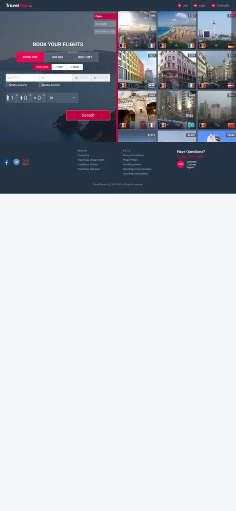
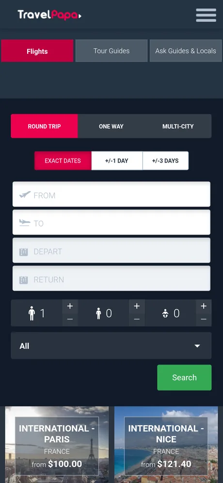
Without adaptation and with it
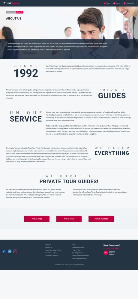
An example of our work: travelpapa.com on a phone screen. On the left, the desktop version shrunk to the width of the screen: this is how a site looks without adaptation. On the right, the same page adapted.

How the adaptation goes
- 01You send the site address.No access is needed at this step, the address is enough.
- 02We look at the site and quote the price and the timeframe.The price is fixed: it does not grow as the work goes on. The estimate is free.
- 03We adapt a test copy.Meanwhile your site works as usual, and visitors notice nothing.
- 04You check it on your own phone.We send a link to the test copy. You see it yourself, on your phone, not in our screenshots.
- 05We move it onto your site.For this we need access to the hosting or to the site admin panel.
The price is fixed, but it is not listed here
It depends on the site itself. So we quote it after we look at the site, and before the work starts.
How many pages. Up to 5, up to 10 or up to 20. A site with more than twenty pages we quote separately.
How the site is built. A layout built with styles is easier to adapt. If the page is made of tables, they have to be taken apart into a column, and there is more work.
Whether the structure needs spot fixes. A menu made of images, text as an image, blocks that styles alone cannot rearrange. We fix such places in the code, and on a computer they look as before.
How to put it live. What the site runs on, whether there is access to the files, whether a test copy can be made. Old content management systems and site builders have their own difficulties here.
Adaptation takes a few working days
We give the exact timeframe together with the price.
Payment by agreement
We discuss the terms once the price and timeframe suit you.
The estimate is free
The site address is enough. It commits you to nothing.
When adaptation is not the best option
A site built on frames, or in a site builder where every block is pinned to its place on the screen. Adapting such a site often costs more than making a new one. If so, we will say so straight away.
We do not promise more sales or higher search rankings. We promise that the site will be easy to use on a phone.
Common questions about adaptation
Will the site change on a computer?
No. The changes apply only to narrow screens; on a computer the site looks as before.
How is adaptation different from a separate mobile version of the site?
A separate mobile version is a second site, usually at its own address, and it has to be maintained alongside the main one. Adaptation makes the site itself easy to use: one address and one set of content for computer, tablet and phone.
Why is the price not on the page?
It depends on the site: the number of pages, how it is built and how the changes are put live. Send the address and we will quote a fixed price before the work starts.
Do you need access to the site?
Not to quote a price: the address is enough. Access to the hosting or admin panel is needed at the end, to move the finished work onto your site.
How long does it take?
Usually a few working days. We give the exact timeframe together with the price.
My site runs on WordPress or another system. Will that work?
As a rule, yes: the changes go into the site theme, and the content in the admin panel stays as it was. What your site runs on and whether it has difficulties of its own, we will tell you after looking at it.
How do I pay?
By agreement. We discuss the terms once the price and timeframe suit you.
Who does the work?
Nicu Emilian, from the estimate to moving it onto your site. Twelve years in front-end: layout and interfaces.
Send your site address
We will look at the site and quote a fixed price and timeframe. You do not need to prepare anything.
This service is led by Nicu Emilian, from the estimate to moving the work onto your site.
If you need a new site rather than adapting an old one: websites and landing pages.
Who we are and what else we do: home page.